
Hi, I'm Pratik.
A UI/UX & Product Designer with 5+ years crafting AI-driven, fintech,
and
enterprise digital experiences — blending data-driven design
with deep user empathy to build products
people actually love to use.
Selected Work
Case Studies

Executive Dashboard · ZS Associates
Data Governance Maturity Model
An executive dashboard that translates complex data governance maturity across business units into actionable, at-a-glance insights — designed for leadership for a Pharma Client.
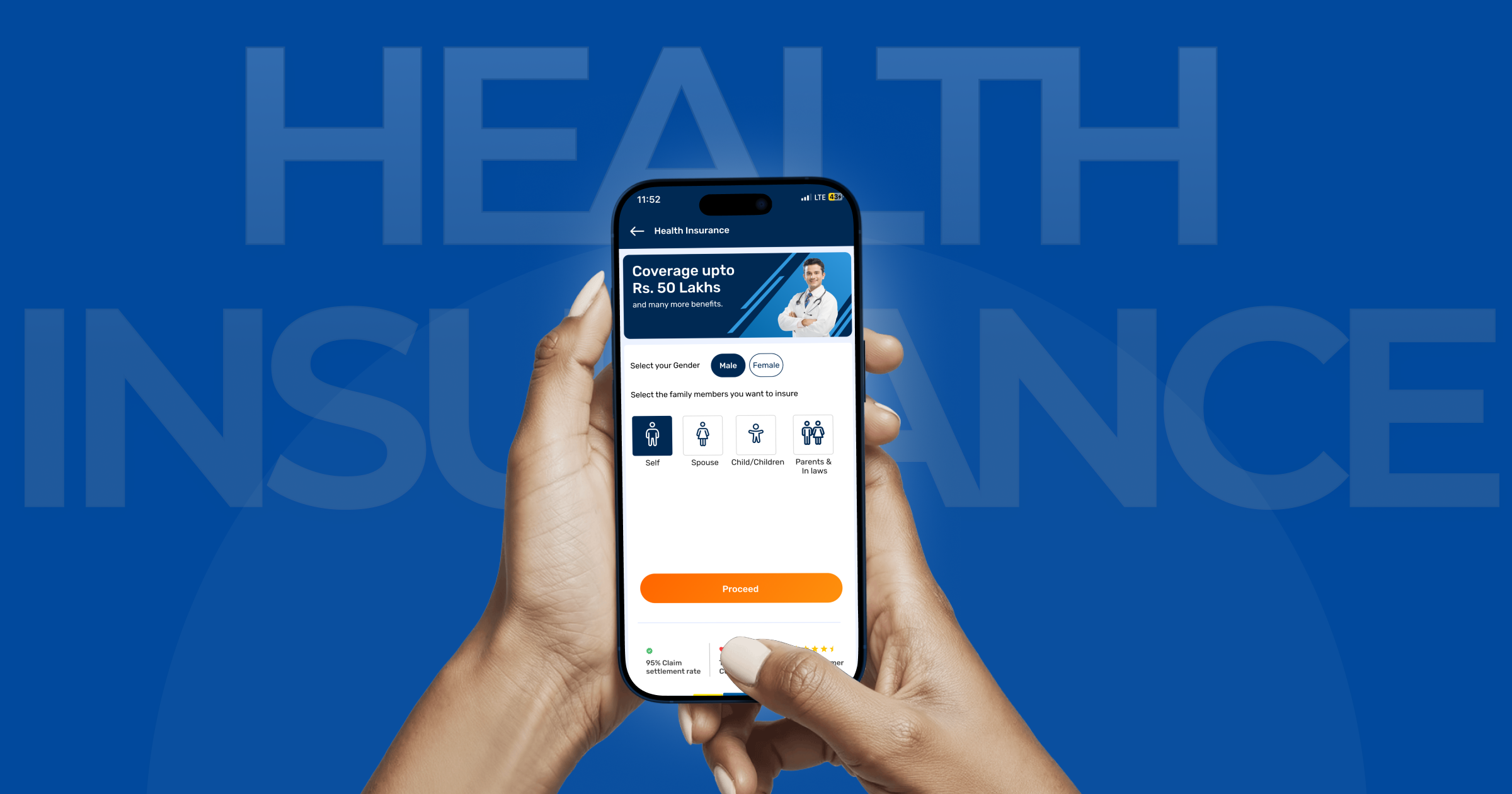
Insurance Experience
Bajaj Finserv - Health insurance Experience
A mobile health insurance purchase journey redesigned for clearer plan discovery, comparison, and checkout confidence.

Website Design · SaaS · Enterprise
Colrows Website Design
A modern marketing site for database governance and security — simplifying Zero Trust for enterprise buyers while showcasing product depth, supported databases, and demo conversion paths.

Coming soon
Job Search for seekers
Making job seeking easier through your browser
Coming Soon
Design System
A comprehensive component library built for scale across web and mobile platforms.
CURIOUS AND EXPLORER
Background
About Me
Over the last 5+ years, I’ve worked on AI-driven products, fintech platforms, enterprise tools, conversational experiences, dashboards, and mobile applications. But for me, design has never just been about screens or visuals — it’s about understanding people, reducing friction, and making complex things feel simple and natural. I enjoy working at the intersection of business, technology, and human behaviour, where even small design decisions can completely change someone’s experience.
Outside of work, I enjoy exploring new places, trying different cuisines, and experiencing cultures through conversations, food, and everyday moments. I genuinely enjoy cooking and experimenting with different flavours — it’s one of the few things that helps me slow down and be creative in a completely different way. Weekends are usually a mix of badminton, spontaneous plans, or discovering new places.


Built with AI
AI Lab
Interactive products built at the intersection of design and AI.
CogniQuest
AI-powered cognitive quiz that adapts to your level.
Next Project
More AI experiments in the making.
Protected Case Study
Enter the password to view the full work.

Executive Dashboard · ZS Associates · 2025–2026
Data Governance Maturity Model
An executive dashboard that translates complex data governance maturity across business units into actionable, at-a-glance insights — designed for leadership for a Pharma Client.
The Brief
A global pharmaceutical client — operating across R&D, Commercial, Global Functions, and GSC — needed a way to monitor their data governance health. The problem wasn't a lack of data. It was a lack of visibility. Leadership was navigating a 19-page static PowerPoint every quarter, manually cross-referencing tables to understand whether their data was compliant, well-governed, and moving in the right direction. Decisions that should take seconds were taking hours.
I was brought in as the sole UI/UX designer to take that 19-page document and turn it into a living, executive-ready digital product.
My Approach
I started with a full audit of the technical framework — not just reading it, but mapping every KPI, its business intent, and what maturity signal it was trying to surface. Through stakeholder interviews, I identified the real question leadership was asking every quarter: "Where are we, how bad is it, and what do we fix first?"
That single question became the design principle for everything that followed. Every screen, every component, every visual decision was tested against it: does this help an executive answer that question faster?
Discovery & Audit
The 19-page document contained six governance dimensions — Data Strategy, Ownership, Quality, Technology & Architecture, Compliance & Security, and Culture & Literacy. Each had its own set of KPIs, maturity signals, and business context. My first design decision was to honour that structure rather than simplify it away. The six pillars became the navigational spine of the entire product — executives could instantly see all six at once on the overview, then drill into any one for the full picture.

The Six Pillars
The 19-page framework was condensed into six measurable pillars, each with defined KPIs and maturity signals — giving executives a single source of truth.
Clarity and enforcement of governance policies across business domains.
Roles and responsibilities across the full data lifecycle.
Accuracy, completeness, lineage tracking, and cataloguing.
Platforms, tools, frameworks and automation supporting governance.
Regulatory, privacy, GxP/GDPR and risk management alignment.
Organisational awareness and data-driven decision-making penetration.
KPI Framework — The Raw Material
Before designing a single screen, I mapped every KPI from the source document alongside its description and maturity signal. This audit formed the design foundation — understanding what to surface, what to collapse, and what the executive eye scans for first.


Maturity Stages & Implementation Model
The model operates across five progressive stages — from Initial/Ad hoc through to Optimised. Each stage defines a clear capability threshold, helping leadership understand not just where they are, but the path forward. This staircase model became the visual backbone of the dashboard's stage indicator component.

Unstructured, reactive, no formal accountability.
Basic practices emerging but inconsistent in scope.
Standardised, documented, applied consistently.
Integrated, monitored, actively driving data quality.
Fully embedded — leveraging advanced technologies for competitive advantage.
Design Decisions That Mattered
Every UI decision came from a specific insight. The heatmap replaced the data table because colour contrast communicates risk in milliseconds — a red cell at GSC/Data Quality tells a story before a single number is read. Executives don't read rows; they scan patterns. The donut chart was chosen for the maturity percentage because a partial arc reads as "in progress" far more intuitively than a number sitting alone. The drill-down filter hierarchy — Business Unit → Sub Business Unit → Function → Year — was designed to match the actual org structure of the client, not a generic taxonomy, so navigation felt native from day one.
One of the most deliberate decisions was the Maturity Improvement Guide. Rather than stopping at diagnosis, I designed a stage-by-stage action roadmap directly inside the product. Each business unit could see exactly what steps they needed to take to move from their current stage to the next. This turned a reporting tool into a change management instrument — something far more valuable to the client than a dashboard alone.
Final Screens
The delivered product covers the full dashboard ecosystem — from the executive overview to six individual pillar drill-downs and a deep-dive data governance policies view. Every screen was designed for self-service: no analyst required, no PowerPoint needed.

Executive overview — Data Governance Maturity Model on MacBook
Data Governance Maturity Model — Overview
The homepage executives land on. Shows the current maturity stage, 40% progress donut, data maturity trend line across R&D, Commercial, Global Func. and GSC, six pillar KPI cards with stage badges, and the full heatmap for at-a-glance risk scanning across all business units.

Pillar Drill-Down Screens
Each of the six pillars opens into a dedicated drill-down view. Every screen follows the same pattern: a maturity gauge top-right, a Sub Business Unit performance bar chart, and an All Metrics grid of charts — making cross-pillar navigation instantly learnable.
Data Strategy
Tracks policy adoption, compliance rate, frequency of policy reviews, and council meeting adherence. Current stage: Developing (Stage 2) at 40% — showing clear improvement opportunity for R&D and GSC units.

Data Ownership
Measures steward assignment, issue resolution turnaround, stewardship coverage ratio, and training completion. At 25% (Stage 2) — the lowest performing pillar, flagging accountability gaps across GSC and Commercial.

Data Quality
Tracks dataset certification, recurring quality issues, lineage completeness, and accuracy scores. At 55% (Stage 3) — one of the stronger pillars. R&D leads; GSC shows the widest gap at 45% on the metadata catalogue metric.

Technology & Architecture
Covers data access provisioning time, governance tool integration rate, curated dataset reuse, and self-service fulfilment. At 25% (Stage 3) — strong in R&D but significantly behind in GSC, indicating tooling investment gaps.

Data Compliance & Security
Monitors GxP/GDPR lineage coverage, audit findings, data access violations, and dataset classification. At 55% (Stage 3). A dedicated bar chart for each metric across all four business units surfaces the exact units needing intervention.

Data Culture & Literacy
Tracks employees trained, data-driven decision adoption rate, satisfaction scores, and governance forum engagement. At 40% (Stage 3) — R&D leads training adoption; GSC lags significantly on decision-adoption metrics.

Deep Drill-Down & Maturity Guide
Beyond the pillar screens, executives can drill into individual KPIs by Business Unit and Function, download tabular reports, and access the Maturity Improvement Guide — a step-by-step roadmap showing exactly what actions move an organisation from its current stage to the next.


What I Delivered
A high-fidelity, interactive Figma prototype covering the full dashboard ecosystem: the executive overview, six pillar drill-downs, a deep KPI table with download capability, and the Maturity Improvement Guide. The 19-page static PowerPoint was retired. Stakeholders validated the heatmap and six-pillar structure as significantly clearer than anything they had used before.
What This Shows About Me
I started with a 19-page technical document and no existing design system. I created structure where there was none — defining the IA, the visual language, and the interaction model from scratch.
My users were pharmaceutical executives — time-poor, data-literate, and skeptical of complexity. Every decision was calibrated for that specific person: instant scanning, no training required.
The Maturity Improvement Guide wasn't in the brief. I identified that diagnosis without direction has no business value, and designed the roadmap feature independently to make the product genuinely useful.
Research, audit, IA, wireframes, high-fidelity prototype — delivered in 1 month as the only designer on the project. No handoff gaps, no miscommunication, full ownership.
Insurance Experience · Mobile App Redesign
Bajaj Finserv - Health insurance Experience
A redesign of Bajaj Finance's health insurance journey, focused on helping users understand coverage, compare plans, and complete purchase decisions with confidence.
Overview
The health insurance journey inside the Bajaj Finance app had a conversion problem: users were interested in buying insurance, but the experience made it difficult to understand plans, compare benefits, and move forward confidently.
The redesign reframed the flow from a long transactional form into a guided insurance experience with clearer entry points, plain-language content, plan comparison, trust signals, and mobile-first purchase steps.
Market Research
Research showed that users were not only comparing prices; they were trying to reduce risk. First-time buyers wanted explanations and reassurance, while family buyers wanted quick comparison, dependent coverage clarity, and confidence that there were no hidden conditions.
At the time of this research, significant competition in the market was present, with multiple digital platforms launching consumer-focused health insurance offerings. The research focused on how people choose health insurance inside a finance app: what they compare first, where they hesitate, and which trust signals make them comfortable enough to continue.
User Research
User research focused on understanding how different buyers think through health insurance: what they need to feel confident, where they pause, and how they decide whether a plan is right for themselves or their family.
User Persona
Freelance graphic designer, Rs. 6-7 LPA. High tech savviness. Buying health insurance independently for the first time.
- Overwhelmed by too many similar-looking plans
- Confused by jargon like "co-pay" and "waiting period"
- Worried about making a costly mistake
- Needs visual comparison of benefits vs premium
Senior Project Manager, Rs. 18-20 LPA. Married with two kids. Looking for full family health cover.
- Can't compare family floater plans in one view
- Frustrated by outdated, unclear app interfaces
- Gets cold calls and spam after policy inquiries
- Needs to coordinate decisions with his spouse
Problem Statement
Users were willing to explore health insurance, but the journey created uncertainty at the moments that mattered most: understanding coverage, comparing plans, and trusting the purchase decision.
The Problem
The overall problem breaks down into four core UX issues:
Excessive steps with no progress indicator - users had no idea how far they were or what came next.
Terms like "co-pay" and "waiting period" appeared without explanation, creating anxiety and distrust.
Cluttered, inconsistent visual design lacked the trust signals needed for a high-consideration financial product.
Similar-looking plans made users read dense text instead of quickly seeing differences in coverage and value.
Design Goals
The Old Experience
The earlier flow relied on cluttered layouts, generic help banners, long forms with no pre-fill, and weak visual hierarchy. The updated screenshot below captures the original Insurance Bazaar journey in one view, making the review, self-details, nominee-details, and empty-state issues easier to inspect.

Brainstorming and Aligning Business Goals
Brainstorming connected user pain points with business goals: improve completion, reduce support dependency, build buyer trust, and make plan comparison easier without adding new complexity.
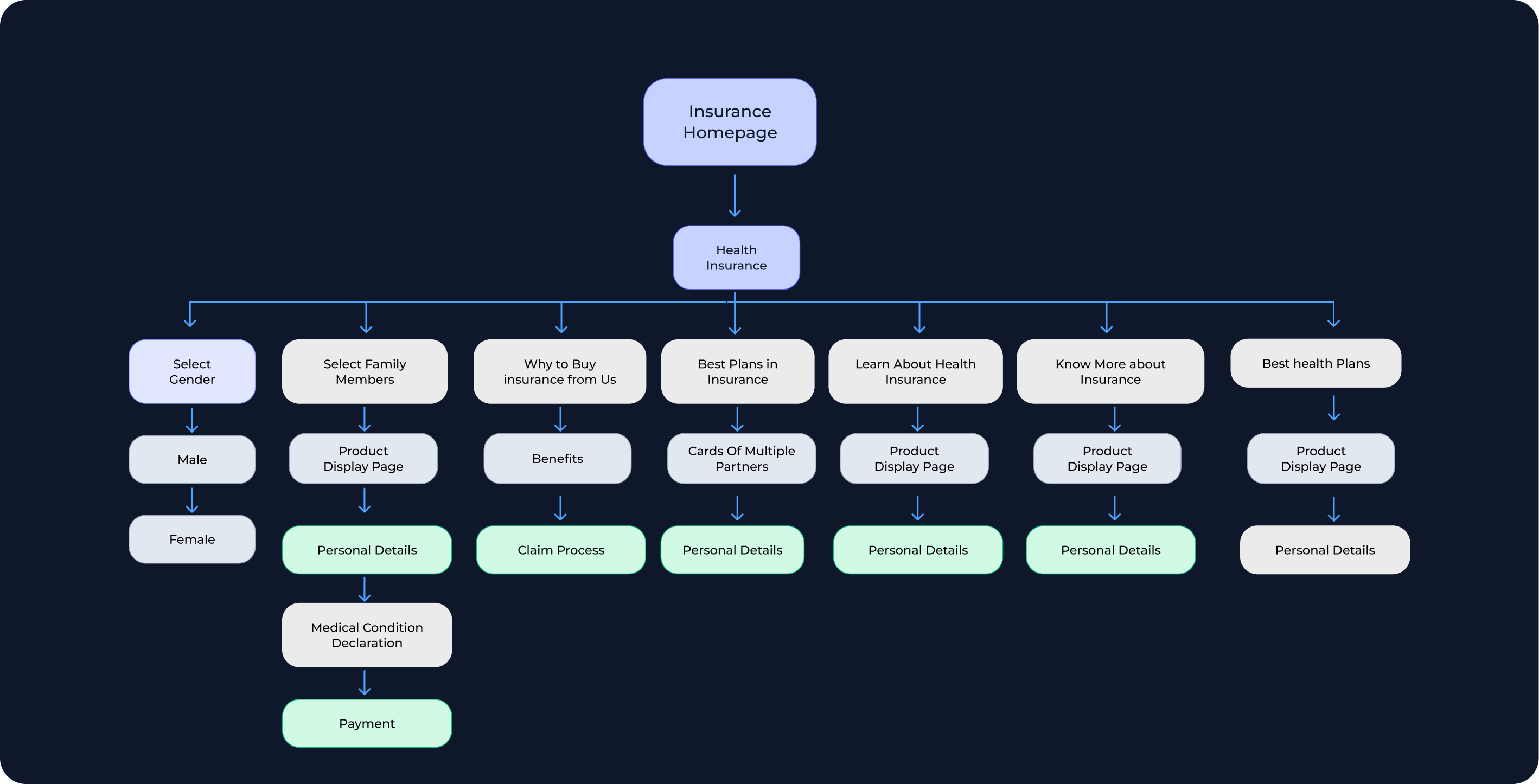
Information Architecture
A well-organised layout that streamlines content hierarchy and navigation — making it easier for users to find what they need without confusion. Every entry point leads to a product display page, then personal details, then payment.
Wireframe
The wireframe stage translated research and information architecture into a workable purchase journey before visual polish. It helped validate the screen sequence, content hierarchy, and decision points before moving into final UI.
Final Design
A refreshed, user-centric experience designed to simplify health insurance purchases — with guided flows, clear plan comparisons, and mobile-first usability throughout.
Health Insurance Landing
The landing screen introduces the health insurance journey with a simple, guided entry point. Instead of asking users to understand plans immediately, it first captures who they want to insure, sets family context, and uses clear trust signals to make the next step feel easier and safer.

Select Plans Screen
Scrollable coverage amount selector, plan for filter showing family composition, and plan cards with "Lowest price" and "Monthly Pay Available" badges. Each card shows insurer logo, plan name, premium, and an "Add to compare" checkbox — enabling 2–3 plan comparison side by side. A persistent floating "Need Help" button stays on every screen.

Thank You Screen
A celebratory payment success screen showing the policy number, period, partner name, and a prominent orange "Download Health Policy" CTA. Below it, the app surfaces pre-approved loan offers and complementary insurance products — turning a terminal screen into a cross-sell moment.

New Flow
A clear, step-by-step path designed to help users effortlessly discover, compare, and purchase the right health insurance plan with minimal friction — from login to policy download.

What I Learned
Working on this project taught me that designing for trust is just as important as designing for usability — especially in something as sensitive as health insurance. Small tweaks in language, layout, and flow could help users feel more confident and in control. It wasn't just about making the app look better — it was about reducing hesitation and helping users make big financial decisions with clarity.
Collaborating with stakeholders from business, tech, and customer service reminded me that great design happens when every voice is heard — and when users are kept at the centre, always.
The Outcome
Transformed a complex insurance-buying experience into a guided, user-friendly journey that increased engagement by 25% and helped customers make informed coverage decisions faster.
Website Design · SaaS · Enterprise
Colrows Website Design
A modern, professional website for database governance and security — designed to establish digital credibility, showcase product capabilities, and convert enterprise prospects through clear storytelling and strong CTAs.
Overview
Colrows approached us to create a modern and professional website that would effectively communicate their database governance and security solutions. The objective was to establish a strong digital presence, showcase product capabilities, and build credibility among enterprise clients.
The Challenge
The client needed a website that could simplify complex technical offerings while maintaining a professional and trustworthy appearance. The platform also needed to highlight key product features, supported databases, and provide clear pathways for potential customers to request demos or get in touch.
Zero Trust, encryption, and governance are hard to explain without overwhelming non-technical buyers.
Prospects need proof — logos, UI depth, and credibility signals before requesting a demo.
Product value, team identity, and contact paths needed to feel like one cohesive brand.
Multiple entry points (Get Started, Live Demo, email) had to be obvious without feeling pushy.
The Solution
I designed a clean and modern SaaS-style website focused on clarity, usability, and visual hierarchy. The homepage was structured to immediately communicate the product's value proposition, supported by feature highlights, trusted client logos, and strong call-to-action sections. An About Us page was also created to introduce the company, showcase the team, and strengthen brand trust.
Design Highlights
- Modern SaaS-inspired visual design with warm orange and gold accents
- Clear product positioning — Zero Trust messaging for enterprise buyers
- Feature-focused sections: security, SQL editor, enterprise readiness
- Database ecosystem showcase across 11+ supported technologies
- Team and company introduction page for brand trust
- Consistent branding, decorative line motifs, and responsive layouts
Final Screens
The final website design presents the core Colrows story through two key pages: a conversion-focused homepage and an About Us page that strengthens company credibility.

Homepage
The homepage leads with the Zero Trust Database Access proposition, pairs the message with product UI proof, and guides enterprise buyers toward demo and contact actions.
- Hero section with clear value proposition and primary CTAs
- Trusted client logos to establish enterprise credibility early
- Feature sections for governance, SQL editing, and enterprise readiness
- Supported database showcase and prominent contact section
About Us
The About Us page introduces the company in a warmer, trust-building way, using team imagery, concise content, and a simple query section to keep users moving toward contact.
- Company introduction aligned with the same visual language as the homepage
- Large page imagery to make the brand feel more human and approachable
- Team section for credibility, roles, and organizational transparency
- Footer and contact pathways kept consistent with the main site

Outcome
The final design gave Colrows a professional online presence that communicates its security and database governance services with more clarity, improves product visibility, and creates a stronger first impression for prospective enterprise customers.